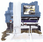
A process sketch of a new project…this is the type of sketch where the client feels like there is some room for change. Even know these are not my best work, they serve the purpose…to give them an idea of how the space will look.
The colours rendered really badly on my scanner. Browns and sand colours do not reproduce well. The two square teak tables are existing, as is the sofa (just needs re-upholstering), and the client has a collection of blue and white, which I will group together under a new hall pedestal table. The carpet will be ivory, and the drapes, a natural linen colour.
The sofa is velvet with a pair of black leather recliners flanking it on each side. There is a sculpture on a credenza behind the recliner, and some of the client’s framed native art. The new valance panels and the recliners will both have nail head trim, and the ceiling coffer will be painted one shade darker than the walls.
Enjoy your Long Weekend Everyone!


15 comments:
Hope the client does not change a thing! I love the table with the vases underneath.
Love it
even if you say the browns dont show well, any client would be able to see what their room will look like.
Very nice rendering, Michelle!
May I ask if you'll present it on tracing paper, or plain cartridge one, or even the scanned version?
Great work,
Anastassis
Hi Anastassis,
Thank you. I use archival quality rag paper for my renderings. It doesn't bleed, and lets you play with the colour on the page without it falling apart.
Thanks for the visit!
Michelle
Great Rendering Michelle....I love the nail head detail on the valance and how you are grouping the blue and white under the hall table. I am sure that your client will be happy for many years with your design.
Patricia
Looks so great even though you just whip these things up in mere moments!
Love the space you've designed!
Thanks for your comment on my easter post!
Michelle,
These are just beautiful....as I have said before, I wish I could offer this to my clients. I am going to take a watercolor class from a friend of mine, so maybe it will help! I agree with Patricia...the nailhead detail on the drapes are a great detail and the blue and white pots I love. Would be fun to have them but they do not fit in my decor scheme now!
Great colors, very talented
At the risk of repeating everything your other commenters have said... love your rendering! I particularly like the blue & white under the table... great idea!
Thanks for commenting on my "define design" post!
Victoria
It's going to be beautiful!!! You are so lucky you can do this!! :)
Michelle,
You are going to get a very cool email soon or a phone call - hint! hint!
I think you need to organize a weekend course in rendering - or you need to start sketching for editorials like House and Home, Sytle at Home, etc or or Write a book in how to render - 101 rendering or rendering for dummies (like me)
Just beautiful. What an amazing room and sketch. I love your work.
Looks lovely!
love to see the evolution of your process renderings.
how do you store them, in portfolios?
pve
I love the design AND your rendering!!! The blue & white vases are so cool in the rendering. I love you you get across the detail without actually drawing a lot of detail. You make it look so easy!!
Kelly
Post a Comment