When I think scale, Phillipe Stark comes to mind, and his Mondrian outdoor Patio, with those large scale terra cotta pots. Scale is a powerful principle that can be whimsical, dictating, and most of all makes us question our own place relative to the world. It can be strong and dictating, like a large scale public statue outside of a courthouse, or timid, like a small scale sofa, that asks you not to lounge for too long.
It’s sister proportion, is in relationship to something else in the space. Many times, proportion can go wrong….too many items of the same size, and apposing proportion to each other…it sucks the interest out of the space, and adds too much tension.
Enjoy these pictures of rooms that I think show this principle well; next week I will look at the design principle of line.


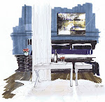
I’ve used this image before; it’s from Pottery Barn a few years ago. I like the scale of small spaces; they are in proportion to the human body, and I am convinced that people are drawn to spaces like this because they feel protected.

The Clift Hotel in Sanfrancisco sure puts scale into focus with this large sculptural chair…a little Alice in Wonderland! Whimsical for sure! I would have loved to have been around that table when they came up with this!

This room by Ghislaine Vinas works because of the large scale luminarie; many times large scale can also be the emphasis in a room, but imagine this fixture in white, or the Mondrian’s pots in white, with, colourful overhead lighting or floor patterns…they are no longer the focus, but just part of the recipe.

slim 0904- Vibia through Inform
I love these luminaries; I think they work wonderfully apposed to this large scale historical interior, and because of the proportion they share with the stair balustrades. In a group, they have more presence, and create a larger scale fixture. Colour as a principle is purposefully absent; instead, the other principles of line, texture, repetition and form are the recipe.

This sitting area in a hotel setting, starting with the large scale fireplace, uses scale nicely. By adding small scale wood rounds that create one large mass, similar to the mass of the fireplace, and styling with alike proportioned accessories, emphasis stays on the art and fireplace wall. Scale is closely related to emphasis, and the bookcases bring our eye to the ceiling emphasising the scale of the room. Of course, colour is at work here as well.


The Agua Spa at the Mondrian in Miami…those oversized furniture legs as sculpture, and the large scale wall filigree is done in just the right proportion. Even in an all white interior, the scale of these pieces is not lost, just not as emphasized.

Interior by Patricia Gray
Patricia has used proportion in this living room in a lovely way, by keeping the furniture in proportion to each other and the space. The chair backs are slightly higher in proportion to the sofa, adding a pinch of variance and interest. The room is soothing, because you don’t have to work too hard to make order of the space. Emphasis is kept to a minimum, counting on form, a neutral palette, and spreading pattern equally throughout the room, visual or perceived. This is an example of an absence of apposing scale, and everything in proportion to each other, with intention. Also, the scale of the furniture does not invite you to lounge and watch TV with your feet up, which is obviously done in another space. The scale dictates the use.

Of course, symmetry is at work here, but choosing large scale chairs helps anchor that symmetry and their form and relationship to the mirrors behind them is very strong. With all these large scale items, the recipe here called for just a dash of sconces in a much smaller scale!

Interior by John Wiley
Beautiful colour here, and the scale of the sofa is large in a smaller room, but it works because the large scale items are limited to the bottom half of the space, allowing the fewer smaller items to shine. This space has a language of “come on in, I’m big enough to make you comfortable- I’m not too fussy!”

Interior by Joe Serrins
And lastly, in my opinion this room to me is missing something…it’s the lack of variance in the size of the furnishings, which causes allot of tension to me…maybe too much. Many things of the same proportion are used, other than the wallpaper. I love the wallpaper/treatment, but think it calls for larger scale furnishings. Maybe because the paper reminds me of nature, where larger rocks, cliffs and fields equalize a forest’s verticality.
When in doubt, look to nature…if you can’t find the perfect neutral, look to those organic eggs in your fridge, if you can’t figure out the right proportion and scale, look to the variance in the canopies of trees, and if you want to inspire whimsy, look to fireflies and tropical fish. Nature has figured out the right scale and proportion for us, all we need to do, as Vincente Wolf said, is “Learn to See”.

11 comments:
Scale is a challenge.
I am so impressed by Phillipe Stark's work.
He is a master at playing with scale.
Patricia Gray's living room design is superb.
All of her work has a calming effect on me.
Lovely post, Michelle.
xo
Brooke
Great post. The other thing that works about that contemporary chandelier in the stairwell is that it keeps the attention on the architecture. A designer also has to decide which will be more important.
John Saladino also explains scale really well. I did a post on him way back when I started my blog.
I look forward to next weeks post!
Very interesting post, Michelle. Scale and proportion are two things I'm still learning. This post really explains the concepts so well.
LOVE the pics of the Agua Spa -- the oversized items in the rooms make the spaces so much more interesting than if everything was in the same scale. Like in the last picture out posted -- I understand exactly what you mean by the lack of variety with regard to proportion. The room would be so much more intersting with a large organic piece, like a chunky wood coffee table.
Congrats on being named one of Patricia's Top 10 blogs :-)
Kelly
Joe's living room should have not been published. Often times rooms do not photograph well, most especially if there is no one single object that stands out from everything else. Well, this is my opinion. He used the tree mural on two projects which, in my opinion is far worse the committing the sin of too much balance, so as to "create tension". You understand, I am sure, often times the most boring interiors (in photos), can be the most restful and satisfying. On the other hand, those projects that photograph so well leave the client feeling as those they been thrown in the "designer abyss", simply a tool to promote his/her business with photography and subsequent publication. For the client that feels this is the pentultimate, they often will succumb to the designer's needs and even fool themselves into thinking they have something unique by someone who is going somewhere. It seems too many desigers wish to make "self" statements, while they forget for whom they design and why. Just my humble opinion, of course.
Very interesting, you explains it so well and tha photos are very nice!
Have a nice week!
/Nettan
Beautiful informative post.
Love the images. The Mondrian is always amazing and Patricia's room is so calming and beautifully scaled.
Hello Michelle,
I do love your blog, it is a great reference source in so many ways.
I will differ from your opinion in that I think the line of the wallpaper going upward balances the lack of furniture height variance, regardless it is a rather lackluster photographed space.
LOVED the pictures of the Mondrian Los Angeles and Mondrian Miami! Thank you for sharing with us!
Great entry! I really like the images that you have use to dress this post.
Ahhhh the Mondrian LA.
I inclination not concur on it. I over precise post. Especially the appellation attracted me to study the unscathed story.
Good fill someone in on and this mail helped me alot in my college assignement. Thank you as your information.
Post a Comment