Showing posts with label video series. Show all posts

Thursday, 7 October 2010

Reader’s Choice…the next rendering video


CIMG1590

Please tell me what you would like to see in the next rendering video!

1. sketching simple one point perspectives  OR

2. small rendering snippets, showing techniques like texturing hardwood, creating dimension with shadows, convincing fabrics, etc.

It’s your call. This could be the last one for a while, as my production crew have other work :(

__________________________________________________

But…after some emails from readers…soon I’ll be announcing my first rendering workshop…and you are the first to know ;)

These days of “how fast can you get it done” and “I don’t want to pay for presentation drawings (though, I do want you to magically show me what the space will look like)” present new challenges for the designer, and I have learned some tricks leveraging what you already have, into beautiful presentations, which your clients will have no problem visualizing and approving.

…if this is something of interest to you or your firm, please email me…I’d love to hear from you. Private, Corporate or Educational. And please, let me know what city you are from :) NYC and Toronto both on my radar, as that’s where the majority of the interest has come from. More news soon.

Rendering Portfolio


Best, Michelle

Monday, 26 July 2010

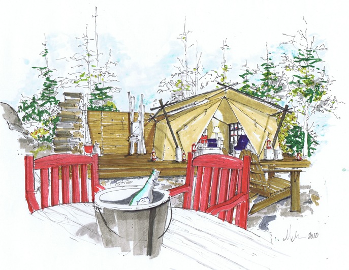
#3 Camping with Tobi - The Video Tutorial

See my guest post on Tobi’s blog; tobifairley.com – follow the video tutorial below, and let’s go camping !!

tobi_camping tent

tobi_camping bathtobi_camping dining table   

 tobi_camping_pinicbaskettobi_camping_lantern  

camping with Tobi materials

Create the Look with these Pieces:

Ralph Lauren: Wing Chair, Picnic Basket, Rattan Chair
Conran: Travel Trunk, Director Chair and Desk
Loll: Red Adorondak
Brent Comber: Stump Tables
Drake: Duffel Bags
Walmart: Lantern
Ikea:Solar Pendant Lamp
Dash and Albert: Rug
John Hanly: Throw
Hermes: Binoculars

Thanks for inviting me to go camping Tobi…for the video tutorial of the tent interior, click below.

Tuesday, 20 July 2010

#2 Greet’s Office – The Video Tutorial

Greets Office

Rendering by Michelle Morelan, 2010

Interior Design by Lefevre Interiors and Greet Lefevre of the Blog Belgian Pearls

greet library

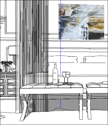
For this tutorial, we are working from photo. This office/library designed by Greet Lefevre has deep shadows and fine liner work, because of the panelling, which also requires some lighting and wood graining techniques. Don’t be afraid of dark shadows; they will give your drawing dimension. And be a little looser in applying your colour and pen weights- that’s the charm of a hand drawing.

Also, sometimes a gesture of an object is better than too much detail. Just like Interior Design, you read it as a gestalt, not as individual objects.

#2 Greet's Office from Schematic Life on Vimeo.

You can watch it in full screen mode by clicking the arrows beside vimeo :) It’s recorded in HD, so keep the HD on.

Greets Office

Thanks Greet!!

Monday, 12 July 2010

#1 Yellow and Blue Office – The Video Tutorial

yellow office MMID

Yellow and Blue Office- Finished Rendering, Michelle Morelan, 2010

Welcome to the first in my video series- #1 Yellow and Blue Office.

Over the last couple of years, there has been interest in me teaching what I do with architectural markers. I’ve always said that anyone can do it, and there are techniques…so here’s the formula that I use typically for un-built spaces. Instead of a computer model, you can also use a photo, replacing and deleting items. I call this the substrate, and it’s the basis for your perspective and rendering. Of course, there are kinds of drawings for ID, from napkin sketches to finished watercolours…

Please bare with me, as this is a learning experience for us, and I had to let some control go just to finish this first video…I knew nothing about the filming process, and it’s more difficult than I thought. 

This video is the demo/prototype version for building the series, and I am excited to share it with you. Please, be nice, it took allot for me to put myself out there, and like many of us, I cringed at the inflection of my voice, or a simple hand gesture. My need to share some of the rendering skills I’ve gained, outweighs the fear.

I’m excited…and thanks to all of you for the emails…let’s see how this goes :)

Best, Michelle

***

Print these PDF renderings from my website to participate in the video tutorial

yellow and blue office shadow dwg for post yellow and blue office texture dwg for post

***

CIMG1911

Materials used in this rendering:

  • Light table set up (glass, lamp and heavy books will do). If you don’t have piece of glass, consider the “as is” bin at Ikea for a glass door or small table top for one of their cheap end tables; just make sure it’s long enough. Always use tempered glass with a finished edge!
  • Paper: both ledger size plain paper and archival rag paper- Bienfang Graphics 360- 100% rag translucent marker paper (this is like tracing paper, but it doesn’t bleed, is thicker and is able to handle the marker manipulation) these sizes are approximate, and you can work smaller or larger if you like. I have a scanner that scans up to ledger size (11x17). Just ask the clerk for marker paper- archival.
  • Drafting tape; it’s less sticky than regular masking tape, but that will do too…just put it on your pants or skin first to get most of the stickiness off.
  • Black fine liner pens: Copic Multiliner SP .03, and .05, Staedtler pigment liner .1 (an assorted pack of thicknesses is a better deal)
  • Artist pen by Faber-Castell in the B thickness; this is a paint brush type tip- a multipack of greys and a multipack of colour is a better deal, but for this dwg, I used 199 (dark gray), 272 (light gray),174 (green), and 247 (blue). There was a quick use of a thicker 180 (raw umber) for the desk, but I went over it with the darker brown to fix it; still this is a useful thickness and colour, and will be used in future dwgs, so I would recommend it
  • Graphic pen 3000 duo tip by Staedtler Mars in 55 (green). These are some of my favourite paint pens, because they pool.
  • Tombo ABt paint pen 491 (glass coloured blue); its duo tipped
  • Copic Markers in W5 (Warm Gray #5), E49 (Dark Brown), 110 (Special Black), E43 (Dull Ivory)
  • Touch Markers CG5 (Cool Gray)
  • Prismacolour 96 (Blondwood)
  • Letraset Tria Marker in 120T (Medium Yellow)
  • A gold roller ball gel type pen
  • A dual tipped black Sharpie
  • Signo pigment ink in UM-153 White

Wednesday, 16 June 2010

Gifted Grecian

A “student” of mine from Greece has been sending me updates on his rendering skills, since discovering my blog, and I have been blown away by his progress! Recently I received this project presentation board which made me giddy with excitement. I’m thrilled to share Anastassis’s progress with you (with his ok). He has used SketchUp to create a basic drawing of the space, producing a measured perspective, then drawn in all of the details by hand. It’s tricky to know how far to go with each, but my opinion is that he has done an amazing job. The shadows, the woven details on the chair, representation and choice of materials…all great :)

Oh to live in that climate!!

I truly believe that hand drawings are more helpful for the designer and the client. They don’t expect later, that he sofa be that exact wood tone, or colour. Computer rendered drawings don’t leave room for that; a client looks at it, and thinks they are getting EXACTLY what they see. With hand renderings, you are able to give a feel for the space, without the expectation to convey every detail.

Just like interior objects, I feel we are going back to things made by hand, and the interface of the computer, in my opinion shouldn’t be used from the beginning of the design process until the end…something is lost. Design and drawing go hand in hand, one cannot happen without the other.

My husband says I need to teach whether people want it or not…it’s true;  this feeds that inner teacher in me…

“Hi Michelle! Would immensely appreciate your opinion about this presentation I'll be making of a patio makeover. I felt brave enough to hand-render the patio proposal, so would like to know what  a rendering master thinks about my humble attempt!...
I'm also sending you the CAD proposal for the interior (living and dining areas). I would immensely appreciate any comments and crit about the design. The client said she would appreciate a harmonious transition from the outside in, so I went a bit Tuscany (baked clay, corn yellow, soft greens etc)
Hope I'm not using up any of your valuable time, if not left with any, just drop me a quick line about the hand rendering!
Thanks a million, a very good morning from (sunny - and bankrupt!) Athens, Greece!
Anastassis”

Other than the sofa needing a bit more depth, I see nothing about this rendering that isn’t amazing! I think your design talents shine through, and hope your client signs off on everything!! Thanks for sending this Anastassis :)PATIO%20PROPOSALcopyanastasis

Thursday, 13 May 2010

MMID- Yellow and Blue Office

yellow office MMID

The combination of blue and yellow is one of my favourites…like Provence or Delft. It’s traditional in it’s roots, but it becomes even stronger when contrasted against modern elements and lines. Romo linen draperies and gold leaf trim inside the panes of the cabinet, nail head trim on the chairs and original art that floats in front of the draperies proves design is in the details. It’s today's traditional.

Design and Rendering by Michelle Morelan, 2010

Sunday, 25 April 2010

Colouring Book (Blue Bedroom) and Materials List for MMID Videos
image


bedroom 2010 2

While we finish up the first video, I thought it would be fun to get limbered up doing a practice rendering…I’ll call these drawings the “Colouring Book”.  Print out the first drawing (doesn’t have to be more than 5x7), tape a piece of trace or rag paper on top, use a fine liner (.05 or .03) to sketch the drawing, apply gray shadows, then colour, darker shadows, finish with fine liner texture and remember some lighting effects. You can use mine for reference if you like, but try using your own colours and design elements like the nail heads, art, rug, etc. This will be our first drawing, so give it a go, keep it as your “before” and date it, because it’s rewarding to look at your progress. I’d love to see some of them, so please…email me your finished rendering! (I would never post them without permission)

bedroom 2010 2      bedroom 2010 2     bedroom 2010 2  

Colouring Book (Blue Bedroom)

Original art, Interior Design and Rendering by Michelle Morelan Design, 2010

<<<<<<<<<<<<< . >>>>>>>>>>>>>>

Materials List:

You can order these online, but a visit to the art store is great to get the juices flowing; go to a type which has a  large selection of canvases, as it will most likely have these supplies; not Michaels…they only carry Prismacolour markers.

CIMG1843

CIMG1911

  • Light table set up (glass and lamp will do). If you don’t have piece of glass, consider the “as is” bin at Ikea for a glass door or small table top for one of their cheap end tables; just make sure it’s big enough to hold a legal size paper, with some space around. Always use tempered glass with a finished edge!
  • Paper: both plain paper and archival rag paper. Use larger than letter size if you can, but you are limited to the size of your scanner- You can work as small or large as you like. I have a scanner that scans up to ledger size (11x17), so I use larger paper. I use Bienfang Graphics 360- 100% rag translucent marker paper (this is like tracing paper, but it doesn’t bleed, is thicker and is able to handle the marker manipulation). Just ask the clerk for marker paper- archival.
  • Drafting tape; it’s less sticky than regular masking tape, but that will do too…just put it on your pants or skin first to get most of the stickiness off.
  • Black fine liner pens: Copic Multiliner SP .03, and .05, Staedtler pigment liner .1 (an assorted pack of thicknesses is a better deal)
  • Artist pen by Faber-Castell in the B thickness; this is a paint brush type tip- a multipack of greys and a multipack of colour is a better deal, 199 (dark gray), 272 (light gray),174 (green), and 247 (blue) are some I use often. A thicker 180 (raw umber) is also useful.
  • Graphic pen 3000 duo tip by Staedtler Mars in 55 (green). These are some of my favourite paint pens, because they pool.
  • Tombo ABt paint pen 491 (glass coloured blue); its duo tipped
  • Copic Markers in W5 (Warm Gray #5), E49 (Dark Brown), 110 (Special Black), E43 (Dull Ivory)
  • Touch Markers CG5 (Cool Gray)
  • Prismacolour 96 (Blondwood)
  • Letraset Tria Marker in 120T (Medium Yellow)
  • primary red, primary yellow markers in any brand listed (if you are on a budget, use a red pen and a highlighter here instead).
  • Gold and silver roller ball gel type pens
  • A dual tipped black Sharpie
  • Signo pigment ink pen in UM-153 White
  • white artist chalk (the powdery stick type)

A tip on markers…a good range of grays (warms and cools) and an architectural pack is a great way to start your collection. Purchase what you think you need and use in your designs…like red, yellow (fireplace flames), greens and browns for landscape and colours of wood furniture. Don’t go to crazy buying vibrant colours at first, as they are used sparingly.

Investment in initial materials? About $200 gets you a nice supply. Markers are about 5 bucks each.

Wednesday, 31 March 2010

Lauren’s LR and Video Series Update

laurens living roomThere are so many creative and gifted bloggers out there; one of them being Lauren from Pure Style Home. I love the soft greens, the large chandelier and canvas she has put together in her living room. . .such restraint! The room is stunning.

**Rendering for Interior Design Video Series Update: I’ll be posting the first drawing (to follow along with) and a materials list over the next couple of weeks. We are hoping to have a 20 minute video featuring a new room every month after that. Tripod issues have slowed us down, but am happy to report there is film on the editors floor (so to speak). Did you know that a video camera tripod is over 1000 dollars? EEK. I’m really proud of my son Jes, who is filming and editing this series :* It’s been great to spend time together, and I’ve gained much respect for what he does.

Rendering by Michelle Morelan, Interior by Lauren Liess