Showing posts with label seaside. Show all posts

Tuesday, 25 November 2008

the seaside room

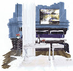
The seaside room at a client's is ready...almost...we still need a white wicker chair, and a woven large rug, but it is stunning, and feels airy, like a summer day.


This is a guest room in a large home, with a view of the sea. The client loves the small village of Hale'eva in Kauai (sorry about the spelling), and wanted the room to reference that favorite place.

There is a fine line between "theme" and "concept". The best way to explain this is to picture the Rainforest Cafe at Disneyworld vs. the building of room elements based on a common element like the Blue Fin in Times Square which references the sea, only realizing this, after you experience the space. I find many decorate in a thematic way, rather than consider the gestalt and space as a whole. A concept is less tangible, but is something to base your decisions on space planning, finishes, etc...

The prints over the Asian chair are the only other colour in the room; they depict local scenes of the Hawaiian village.

The coral is framed in old fence boards, and is actually local! White bedding contrasts nicely against the black bed, and Carrington Beige by BM is used on the walls.

This is what you see when you walk in the room. The black bamboo bed is Ralph Lauren, and was a bitch to put together requiring wooden pegs and a rubber mallet.

The transoms let in light, and when lit from behind are a work of art. Andre Sperling of Barclay Glass created over a dozen for the home.

Saturday, 27 September 2008

Dutch Seaside Home

I have been browsing through the European mags that I brought home with me, and came across this amazing canal side home near Amsterdam. It's owners, Henk and Saskia Teunissen have transformed this 1920's home with beautiful references to the sea that are present everywhere you go in the Netherlands.


Formal symmetry and informal textural siding and furniture juxtapose each other, allowing you to feel comfortable yet pampered by the spa white upholstery
There is a lack of colour palette, but one rich in texture and married to nature in an uncomplicated way


The ceiling beams and antiqued walls refrence the age of the house and to Amsterdam's past. Whites and ivories work together with the grays and browns being a buffer
Washed concrete and wide plank floors remind you of the age and location of the house. The reflective pieces provide a modern touch and another layer without adding colour. I love this home because of the way the homeowners used texture and colour, mixed in history and what works for a modern family.
Greys, browns, black and whites are mixed in a perfect ratio in the kitchen. Natural linen drapes in grey tones let some light in, but provide privacy and light control
The master bedroom includes a woven wing chair bed design; I always start with good quality white hotel linens on the bed, and add colour or texture. This throw adds instant texture and implied comfort. The room also included that punch of reflective in the lamps, table and tray service, and the drapes draw thier colour and texture from the throw and the chair...a nice mix that works well

I have been reading and while in Paris noticing this "Parisian empty" look. I think this bathroom speaks to that. There is an "under construction, pictures not hung yet" look. The old chandelier may have been purchased at the Paris Fleas, and the existing beadboard is simply painted. The floor is interesting and includes the colour palette of the interior; from greys to browns to ivories. Collected items have implied importance, and there is a restraint practiced. The home has not lost the feeling of being developed over its lifetime