 |
| Corner Fireplaces are tricky...this one needed more room to breath. Taking down the wall between the Living and Dining Rooms was a good start, and working out the proportions of the fireplace, creating returns back to the wall, and finishing it in drywall and paint brings it up to date. |
 |
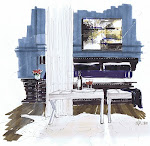
| Design and Rendering by Michelle Morelan |
 | ||
| working things out in SketchUp |
 |
| some details have to be precise |
 |
| The fireplace now looks in proportion, doesn't take up too much visual space, and with the removal of the wall, can breath, not feeling crowded. |
 |
| Much better...nice job putting it all together Janette :) |


12 comments:
Gorgeous transformation Michelle! I find that the new fireplace, all in white, makes the room appear taller... the photo showing red-brick fireplace & room looked like a basement-height room. Such a wonderful difference to the space - light and airy!!
Love!!
Victoria
Wow! What a transformation! Well done.
oh dear -love the after! a mod moose on the hearth. love him.
pve
Nice transformation! How lovely to be able to enjoy the fireplace from the dining room as well.
Beautiful transformation. Now the room can breathe! Love how you mixed modern and antiques!
Cheers,
John
Transformation is fantastic! How important scale and color are . Dull, cramped and dated into vibrant, airy and modern. Bravo Michelle.
Fabulous transformation! How scale and color are important. Dull, cramped and dated into vibrant, airy and modern. Bravo Michelle!
OMG Michelle! stunning!! I can't get over the fireplace!!!!!!!!!!!!!
fabulous!!!
Joni
Amazing! This is the type of before and after that I love!
Wow, great job! I love how open and airy the room looks now. The white wall makes a huge difference.
Love what you did Michelle. Getting rid of the brick and streamlining the wall, brilliant! Beautiful room.
Removing the wall is a brilliant idea. It really added some extra space and the room appears a lot bigger now. I am also in love with the interior of the house. It looks really sophisticated.
Post a Comment