Saturday, 29 January 2011

Vancouver Loft - new pictures


loft - stump vingnette

stump table by John Ross is 40% off right now, and urchin box - Heather Ross

chair – Kozai, Vancouver

loft pics - lemon vingnette

photograph and concrete planter – Heather Ross

  It’s definitely time for a website upgrade, so yesterday my very gracious loft client let us in for the day to photograph the work I did for her last year…I have another client’s space to shoot the end of next month, and look forward to a new website sometime this year. Seems no matter how qualified you are, the pretty shots bring in the clients, hence the investment.

Can’t wait to share more of this space with you…and thanks to Heather of Heather Ross in House who let me borrow a few accessories for styling, and took some wonderful professional photos (these are just captures)…do stop by and visit Heather…she is at Granville and 6th (on 6th) here in Vancouver. You will not only see how talented she is, but also professional and kind, it’s a rare mix.

Best, Michelle

Wednesday, 26 January 2011

Small Case Study #2 Genevieve and David

DavidandGenvieve_DR

After they sold the large house, you would think Genevieve and her husband of 45 years, David would be travelling abroad or settling into a nice retirement community, but that is not what they are about. Genevieve worked as a book editor and lived in South Africa, where she met her husband David, an events planner, so they have done their share of travelling. Later, they had three girls and raised a family in a large modern house in Burnaby. A few years ago, they bought a 1400 square foot condo in Surrey close to family and needed some ideas for the downsize.

The reason for the detailed introduction is to be clear about the importance of your lifestyle on your interior space. How will your life change, and what parts of it will stay the same…that is the important design question. A fresh start at any stage of your life can be cleansing, but your style shouldn't be washed down the drain.

Genevieve has lots of books when I met her originally. I was struck by the volume of books…obviously a strong indicator of what is important to her. When I asked what she valued more than anything, it was her library, and she was quite upset about having to get rid of even one. I had different thoughts about her beloved collection. You design around your lifestyle, so I suggested she take the books with her, and build bookcases around the whole perimeter of the living/dining space. They would envelope and hug her like they always have. Besides, keeping your favourite collection in tact tempers the life change of retirement and downsizing. This also meant that the other smaller collections that didn’t mean as much could go. It’s impossible to move everything from a five bedroom house into a 1400 square foot condo.

So, we would work in the books as a design element, and incorporate a library type dining room with wing chairs and lots of light for reading (as I approach 45, I find myself needing more light to read). It’s an unusual formula to space planning, but they don’t entertain formally any more, except for their monthly book club meeting, and are mostly invited to the kids’ homes for holidays. It’s a lifestyle that they are looking forward to embracing.

Two love seats worked much better for the couple, because of the depth of the bookshelves and the symmetry the pair create. The bookshelves are made of walnut, a traditional wood without yellow or pink undertones, and are washed with light from the directional ceiling pots, highlighting their importance. By including a few artefacts from their collection, small lamps and some serving pieces, the primary task of the space is revealed; if only slightly.

Genevieve wanted jewel tones, so we used emerald, ruby and sapphire hues for the upholstery. The sofas are trimmed in nail heads and upholstered in deep sapphire cotton velvet…David loves the texture. A back wall is painted in a deep ruby colour to highlight a lighter work of art, and has a relationship to a couple of smaller items like a pillow and blanket. Hanging your pictures, art and even a mirror on the bookshelf is a great trick for making it read as one surface and two transparent side tables open up the corridor, and provide flexibility.

The couple is moving in the Spring, and have already changed their book club invites to read “David and Genevieve’s Library”.

DavidandGenvieve_LR

Written, Illustrated and Designed
by Michelle Morelan

www.michellemorelandesign.com

Monday, 17 January 2011

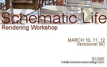
Schematic Life Rendering Workshop March 10,11,12

CIMG1306 CIMG1315 CIMG1308

Looking forward to my first workshop in Vancouver, and have enjoyed talking to those have contacted me by phone and email. Some publication work and some ID projects have been keeping me busy, so I have not done a mass mail out yet, but please give me a call if you are interested in joining us here in Vancouver in March, as I need at least 6 to go forward.

yvr announcement 2011 long for footer

Here is some more information:

Create stunning presentations with minimal effort…leverage what you already create for a project, and win more contracts. Do you ever think…”if I could just show them what it would look like”, or wish you could draw more effectively in front of a client? In this day of “how fast can you get it done”, I have figured out some shortcuts and tricks that free us from those long hours doing a single one point perspective.

As a designer, drawing is an essential tool, and computer renderings can be cold, and timely to render effectively. Hand drawings have been making a comeback, and part of the reason is the conceptual nature of them…clients don’t expect it to look exactly like the drawing…yet, it instils confidence.

The other component of the workshop is the collaborative nature of designers when they get together…it’s important for us to discuss WHY and WHEN and to WHAT extent we draw and render a project. When is a simple sketch enough, and when do we invest the time to create a more detailed rendering with colour?

____________________

Starting with a wonderful meal at the Rain City Grill, then 2 days of drawing and rendering interiors at Kwantlen Polytechnic (near the airport for the last day). March 10,11,12

We will be sketching by hand, mostly, but some 3 modeling underlays as well, which I will provide if you do not use 3D software. I thought we would end early on the last day (Saturday), so you could make it home for that one last day off before the work week starts ;)

I will bring the larger tools, and there will be a small materials list. The cost of the workshop is $1395 plus tax. This includes dinner the first night, use of required larger tools, and two days of instruction. 

You will go home with a current project rendered in full colour…I am looking forward to meeting you!


bergere chair

Best, Michelle

Friday, 7 January 2011

Projects of Past…Ucluth Lodge and Spa

I was going through old files, and came across these early SketchUp model renderings from my final year of college. It is an adaptive re-use project of a local fish plant, from working plant to a boat in eco-resort. If you are a student of interior design, and read my blog, please know that this is the most freedom you may ever have, as budget and time issues (not dynamic ones, at least) are not working against you- so push it and have fun. I learned SketchUp in a month; it’s that intuitive.

My favourite part of the project was the sunken glass tide line room where you could watch the tide deposit shell life. The rooms are in the old cold storage building, and the spa was the shrimp room…so much fun. The sushi bar was called Kimoto’s after a local Japanese founding family. I thought it had a real Cannery Row meets Long Beach Lodge feel.

*note, the middle dwg is a process dwg

30-01-2009 8-29-36 AM

jan 31 sk up east view

27-01-2009 8-24-49 AM

Thursday, 6 January 2011

Interior by Kelly Wearstler

kwestlerOde to Kelly WearstlerThe Viceroy in Palm Springs…things are busy around the Schematic Studio, but I did this rendering a few months ago, and wanted to share a favourite interior to start a great new year. When I think Kelly, I think colour…wonderful vibrant hues ;)

Happy New Year!!!!! What a great one it’s going to be.