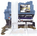
I love your current header, but I can appreciate that sometimes a change is needed. So... like your other commenters, I'm voting for #3. I'm not sure if it was your intention, but it makes me think of an interior designer out shopping amongst beautiful things! Victoria @ DesignTies
I like #2 best. I love the font style of "A Schematic Life", and also how the image is only on the left side of the header. It's kind of subtle and understated, and there isn't too much for the eye to take in. And I can see the nature you love in the tree through the window :-)
The image in #3 is great -- I think if it wasn't quite so wide, it would be perfect :-) Again, just so that it doesn't dominate the header.
#2 I really like it nice clean and sophisticated byt then again you have Ivan Meade (the best on these issues) to consult with, why do you need us !! :)
I like #2. It's the least busy. It's more about people than objects - the human figure is more important. The script looks like person wrote it rather than a font design.
To be honest your original header is stronger - I will include your logo for your business and brand your banner to tie it together with your website. So your blog and your website don't feel like 2 different entities.


17 comments:
I love all of your sketches so It's hard for me to pick, but I think number 3 stands out the most for me, then 2, then 1.
Hope that helps!
I agree with High-Heeled foot. No 3 is a winner. Unless you are a lamp designer named George. :)
I love your current header, but I can appreciate that sometimes a change is needed. So... like your other commenters, I'm voting for #3. I'm not sure if it was your intention, but it makes me think of an interior designer out shopping amongst beautiful things!
Victoria @ DesignTies
I like #1 and #3! Of course anything you do is fab!
I like #2 best. I love the font style of "A Schematic Life", and also how the image is only on the left side of the header. It's kind of subtle and understated, and there isn't too much for the eye to take in. And I can see the nature you love in the tree through the window :-)
The image in #3 is great -- I think if it wasn't quite so wide, it would be perfect :-) Again, just so that it doesn't dominate the header.
Hope that helps :-)
Kelly
#2
I really like it
nice clean and sophisticated
byt then again you have Ivan Meade (the best on these issues) to consult with, why do you need us !! :)
Definitely #1 for me, lovely use of parper space, maybe with a slightly improved font.
All three are great, excellent job Michelle!
They are all great..., but maybe the last one shows off your range of drawing, and you can still see your Title quickly and at a glance.
What's your fave?
I like #2 the first one is too 'lamp designer' and the 3rd one is too much I think. I need a new header too!
I like #2. It's the least busy. It's more about people than objects - the human figure is more important. The script looks like person wrote it rather than a font design.
Allow me to say that I am jealous of your talent!
I like #1. Clear and simple design.
Jane
I like #2, but I still love the original header! Are you sure you need to change?
To be honest your original header is stronger - I will include your logo for your business and brand your banner to tie it together with your website. So your blog and your website don't feel like 2 different entities.
I know you will come up with something that fits your
"schematic life!" love your sketches and your doodles too.
pve
Your sketches are so charming!
I think I like #2 the best, although it's hard to choose.
xo
Brooke
I think # 3 is too busy and #2 can have just a little more, a balance between the two would be perfect. My 5¢ opinion.
Post a Comment