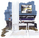
A rendering commission from this past year features natural stone and coral coloured accents; the designer used hexagon tile behind the stove and an end grain butcher block. There is a baking area, double islands, a walk in pantry and lots of traditional details. The lighting, finishes and fabrics keep it young in feel. Below, annotations are signed off by the client before the final rendering step. I think she did a great job!
skip to main |
skip to sidebar
Friday, 8 January 2010
Subscribe to:
Post Comments (Atom)
NEW!!!!! Subscribe via email
Search This Blog
My Blog List
-
-
PLEASE UPDATE THE RSS FEED1 year ago
-
Runway to Room: Fall Inspo2 years ago
-
Marrakesh Cool3 years ago
-
-
This feed has moved and will be deleted soon. Please update your subscription now.5 years ago
-
-
Textbook Tuesday | Near & Far6 years ago
-
Il Paradiso dei Sogni8 years ago
-
thank you8 years ago
-
i'm not one to brag, but...8 years ago
-
Daily Inspiration On Instagram8 years ago
-
-
We've moved9 years ago
-
-
My Favorite Rugs - Feizy Rugs9 years ago
-
-
Pure Joy Home10 years ago
-
Labour Day 201510 years ago
-
Life in White...10 years ago
-
A new chapter unfolds10 years ago
-
-
Small Modern...The Schematics11 years ago
-
Until Soon11 years ago
-
Foodie Friday11 years ago
-
-
-
This Blog is a-Movin'!12 years ago
-
-
BLEND 201213 years ago
-
NYIGF 201213 years ago
-
Blogfest 2011 Recap: The Places14 years ago
-
-
-
-
-
-


17 comments:
This is a gorgeous rendering. I would love a kitchen like this one.
Michelle
I think that YOU did a great job of firming up the details for this design. What a wonderful visualization for the Designer to show her clients what their finished kitchenook will look like.
Wonderful work, Michelle... you're a phenominal talent!! Love the perspective you've used for this rendering - like you're walking down a set of stairs and catching a glimpse of the kitchen. When Patti's bathroom is done I'll have to commission a rendering from you...
Victoria
Beautiful, Michelle. I so appreciate that you share these.
Wow! This is stunning! Wish I had your talent.
Have you seen the room finished? I'd enjoy seeing how it turned out.
No, I haven't Terry, but by now, the client has moved in. The drawing was modelled in SketchUp, and the designer several sets of changes, but it's a kitchen, with lots of details to be worked out.
Gorgeous! Love the care with which you delineated the bar stool fabric. Sweet!
I wish I had your incredible talent. Such a rendering gives the total concept and feel of the kitchen, which CAD alone cannot achieve.
Amazing as always Michelle. The detail in the stool fabric is so cute!
Great rendering, great angle...
I have not done a perspective in years, wish I had my drafting table to put one up...I use to enjoy seeing the floor plan come to life...
Do you use markers? On velum or tissue? I once had to copy a perspective to water colour paper and use watercolour paints to render it in design school...that semester I could not afford the markers...
Love your work, enjoy seeing the shadows you use.
Regards, Carol Ann
Beautiful rendering. I wish I had this rendering in front of me for one of my kitchen rendering projects! It's wonderful.
Hi Michelle!
Lovely kitchen rendering!
Hopes of a blessed 2010 for you!
xx-
Michelle
I believe you have already a big group of eager students if you'll go ahead with your podcasts project. You are amazing.
Michelle, Your renderings are drop dead beautiful! I look forward to seeing your video pod casts! Best, sharon.
p.s. thanks for stopping by my blog!
I keep saying this, but your renderings are getting better and better Michelle. Great job, amazing detailing.
Oh wow.
Suzanne said you were good and she is not wrong. Beautiful drawings.
Post a Comment