As you may have read, I am answering some questions for Scott in Virginia who is working on his Master’s Degree in Interior Design (wowsa!) I answered his questions via email, and was about to send him examples of drawings through the process of a project that he requested, when I though I would just post on it instead.
I have not had the opportunity to work on a hospitality project like this one I did for my Thesis Project a few years ago, so I chose it to document for Scott. Can you believe I still hold on to it? I just never felt more free in my life…being pushed to a high level of design, and without a budget!! I look back to my education as a wonderful experience in my life.
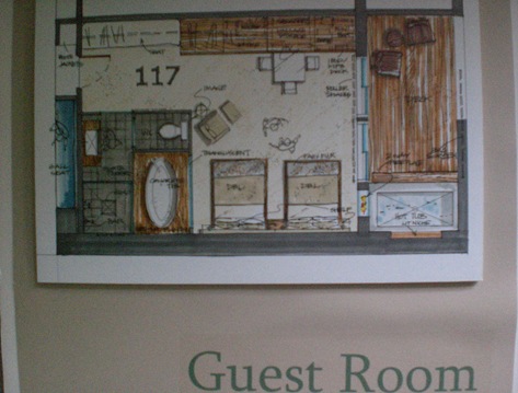
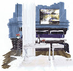
The project; well, you may recognize it by my header, which is a typical guest room at the Ucluth Lodge and Spa in Ucluelet, BC. It’s an adaptive re-use project, turning an old fish processing plant into a eco lodge and spa with water access.
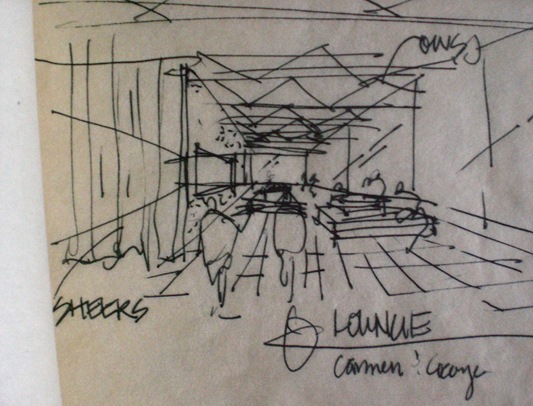
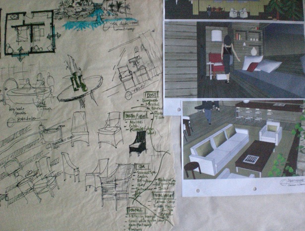
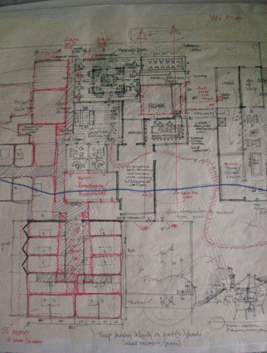
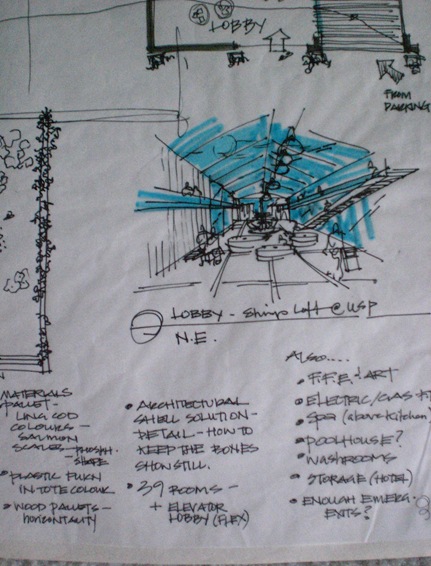
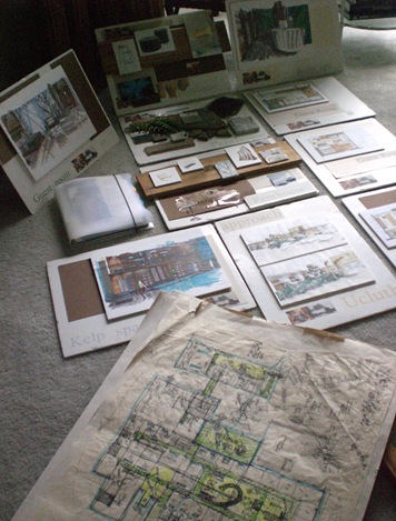
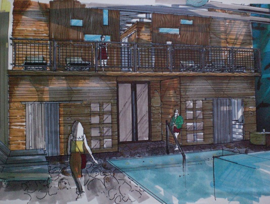
The sketches really are different through the design process. You start with programming and gathering information, zoning and bubbling diagrams, space planning into materials, to detailing and all the time respecting the architecture and site. The following sketches reflect all of those phases of design. This would complete the design process, then you go on to Contract Documents, which are working drawings for the project. Working in 1/4 inch scale is best for interiors, and you should always work to scale; space is deceiving.
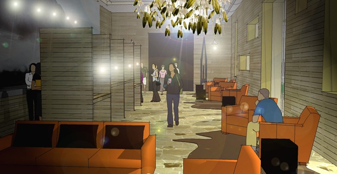
I kept a 3d model in SketchUp going along side the CAD plans to assess the spaces in 3d instantaneously, but earlier in the process, I did quick perspectives like most of the ones you see below. The last computer image is rendered with light in Photoshop.
We certainly have to love it to do it, don’t we? Dale over at the Hospitality Design Inspiration blog is blessed to do large scale hospitality work for a living…I am so envious.
Let me now bore you with the details so Scott can use this post for his project. I tried to keep it chronological. I used a block of newsprint to keep the process in order, now I am glad that I did.
In residential design, many times there is no budget for renderings, but quick small elevations and trace paper drawings in plan are the norm. I like to do a vignette rendering for a client anyway…as a gift. I think I am going to start doing front doors.
Now I am off to listen to Charlotte Moss over the the Skirted Roundtable…wow…those ladies are really getting the best of the best!!
Even know I love this last computer rendering…there is something more tactile and experiential with hand drawings.












13 comments:
wow, wow, wow.
I am currently sitting in my Masters Thesis Interior Design course and looking at my sketches and looking at yours - and well, I have a lot to work on.
Thank you so much for sharing these. I wish I had your free hand. Thank you for being so inspiring.
Best,
Samantha
I have talented friends who can sketch. I'm in awe. Each page is art to me. They throw them away. Glad you kept some and show them to us.
I second Samantha....WOW.
Fabulous.
Only one word describes this entry... P A S S I O N
Michelle, this entry show case your passion in live. The energy and the ambition of your ideas. Each line describe why you are so talented.
I am so proud of you, your talent and creativity definitely inspire us to be better designers and colleagues.
How fun to see all your sketches! Takes me back to class! And I agree with you about hand-drawn vs computer-drawn. The personal, human touch of a hand-drawn sketch just "feels" so much better.
Holy smokes!! That's a lot of sketches!!!! I've drawn one basic floor plan for my drafting class, and that was hard enough. I can't imagine how much time and work you put into all of these!!!
Enjoy the puppies :-)
Kelly
Wow, that is a lot of work, Michelle. Very impressive and informative. Hope you have a great weekend!
Love it, Michelle!!! Looking through your fabulous drawings reminds me of my Design Basics class, although that class only provided me with a snippit of what interior design drawings are all about (i.e., your post today)!! Have to admit... I struggle a bit with bubbling diagrams! Silly me!!
Hope you're well!
Victoria @ DesignTies
It's always fascinating to see how successful you are at bringing your intent of design for a project to life through your sketches. Very powerful, and you're clients are lucky you can bring this tool to them so gracefully.
It's funny, but the one project I failed in design school was the hospitality project, and now that's all I do!
Michelle WOW
Amazing
As Ivan said this only shows your passion.
Great post
It's funny, nobody ever asks how you did in school...you are only as good as your last project. Failed Dale? I can't beleive it. Hittin' the sauce with your classmates that semester? LOL
Thanks Sam- I'm sure your sketches are wonderful!
from the sketch to the top! wow! really great designs! love them! I've been doing a job for collage with interior design history, I found this site called: Yellow documents, they've a lot of documents with things of interior design, and great advices!
I wish I had your talent (and yes today I was able to open your blog...miss you and see you soon...)Ciao
Post a Comment