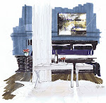
 I'd call my look nature inspired, but love the juxtaposition of mid-century modern with natural materials. In this hotel lobby, I've used different tones of wood as a treatment on the fireplace (could have code issues here), a monolithic chunk of wood for the coffee table from Live Edge Design, and a 8' long fire strip by Sparkfires.
The Eames Aluminum Group Soft Pad lounge chairs, the George Nelson Bubble lamps and the glossy Flos Spun Light F modern floor lamps provide balance, and remind us of man made vs. natural.


maybe these alder rounds by Brent Comber
 Again, I am into this palette of moss green and rusts. Red and green are opposite each other on the colour wheel, and the two colours have the same value within their own family. Greys give a neutral background and black anchors the room.
I love hospitality design, with it's mix of residential, restaurant, retail and lounge spaces...it's the marriage of the program and the concept that excites me.
See my thesis project here. I'm still waiting for that developer with a vision to develop the Ucluth Lodge and Spa in Ucluelet BC.
Also, for some eye candy, Colour Me Happy did a post recently on hotels in London.
renderings by Michelle Morelan, Interior Designer, BID


6 comments:
Lovely concept Michelle.
I too like rusts and lime/mossy green It works well almost all the time.
This is going to be incredible. I love the moss green/ rust combo too!
Your thesis project is amazing...and now I know where your Blog header is from.
Great entry!
I love the Eames chairs and the Modernica lighting. You are a master of sketching.
In my opinion, hand drawn visuals have so much more character.
Hey, how could I have missed this amazing post until now! You are so talented dear friend! And thanks for linking to my blog!
x
Maria
Post a Comment