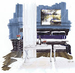
Designer Jacquie Cao hired me last year, and has been gracious enough to send me updates…here is the finished kitchen, and the original rendering from floor plan and specs…the lighting is stunning isn’t it? It’s from Remains. There is a great pantry around the corner…you can see it in the video. Beautiful job Jacquie :)
When you see a project in 3D, you can see what you love, and what needs tweaking, before it’s too late.
For rendering services contact me: www.michellemorelandesign.com


19 comments:
So clean lined and nice
That is really nice to see. So many designs are never built. I like like the floor and ceiling.
How did the renderings change the design?
Very cool to see rendering to actual design. Did you use Revit for the walkthrough and floor plan?
Hey Terry,
The backsplash tile, niches over the stove...the barstool choice...but she stayed pretty tight to her origial design.
Jux...I use SketchUp :)
Stunning!
No more designer watercolours after the show - Michelle Morelan is the real thing - she does her magic before even the show starts.
Michelle I remember these rendering from last year.
Stunning. Love how you showed all the details down the color inside the cabinets.
When I think about it, how would anyone be able to work on a large renovation with an interior designer WITHOUT your fabulous renderings?
They really bring the project to life in a beautifully accurate way.
-Ann
What a gorgeous space! You must be so pleased, Michelle! Great job.
Just came over from Tobi's blog. You are good!!!
Very nice. The double island idea is very interesting!
Love the kitchen design and your 3D modelling portrayed it beautifully. Michelle, I should have used your services for Gail's kitchen reno that I'm currently working on, she's extremely challenged when it comes to visualization, even with 2D. Next time,,,,,,
oh so beautiful!
Love your rendering - interesting to see what was changed from the original design.
Great to see the final images. What happened to those beautiful and fun chairs with colored textile? I guess they decided to be more conservative instead?
Well done, Michelle.
It is so fascinating to first look at the rendering and then the actual space. The kitchen is truly beautiful. I actually saved the image.
I absolute would use Michelle's services again. many thanks! renderings go along way in visual planning such a larger room (24'x23').
thanks for the great comments. here're some observations - I decided against using 2" hexagon tiles for backsplash and instead went with 6x12 in a brick pattern once I realized the scale/proportion wasn't right. and you can kinda see this flaw (busy pattern) in the rendering. this was my first time specifying double islands and having seen the room in action, I think it works really well. guests always seem to congregate around the island, and since there are two, traffic/workflow isn't interrupted for the cook. as for the bar stools, I too would have preferred the upholstered stools in the sketch but clients weren't convinced and were worried about upkeep - a valid point. I got custom cushions made to soften the wood stools instead. in any event, these small details are easy and relatively inexpensive to change.
Thanks for the sharing your comments Jacquie...much appreciated...it's a stunning kitchen!
Best,
Michelle
Beautiful kitchen! Almost as lovely as your rendering of the space, Michelle ;-)
Victoria @ DesignTies
Your 3D modelling portrayed it well!so great to see rendering to actual design.love it stunning and accurate as well.Fantastic post!thanks. :-)
xoxo
Victoria
Post a Comment