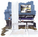
Walnut floors, woven window shades, and a great striped Robert Allen fabric on a modern armless wing chair keep the look updated without being too pink or yellow in undertone. Touches of black in the art, mirror and pendant help ground the space.
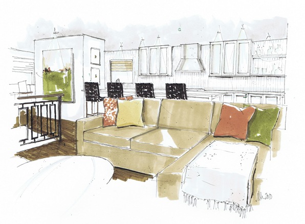
I am proposing both this plan, and one with a square moulding wall in the dining room, and a 1x2 marble mosaic (in mixed emperadors) over the back kitchen wall. A new custom designed wrought iron railing with walnut stained handrails and new lighting gussy up the approach up the stairs. Small recessed pots on dimmers allow the rooms to be adaptable and glow in the evening, when my clients are mostly home.
A bar is located on the right side of the kitchen…something on HIS wish list, but still blending into the kitchen, and her vernacular.
Interior Design and Renderings by Michelle Morelan Interior Design, 2010


7 comments:
Michele,
This is so smart! I love how the cabinet that houses the refridge/pantry makes for the perfect sized wall on the opposite side to display art at the top of the stairs. Serves it's purpose well so the refridge is also hiding from the living area. Can you tell I don't like "ice boxes?"
Lisa
I love that nook in the widows at the end of the kitchen.
I don't know what they have now but I am sure they will love your ideas. Efficient kitchen, elegant layout. Presenting a perfect rendering like yours surely help clients making decisions.
I'm sure they'll love your ideas - I know I do!! You're such a talent, Michelle!!
Victoria
Very clever use of the "structural form" as a visual screen/foil for what appears to be a stair as well as a knuckle around which the space revolves. Classic galley kitchen. I love them!
Good luck with that. Your ideas look amazing!
If you are in Victoria let me know :)
Great clean lines, and I like the plans you have for updating the area!
xx
Post a Comment