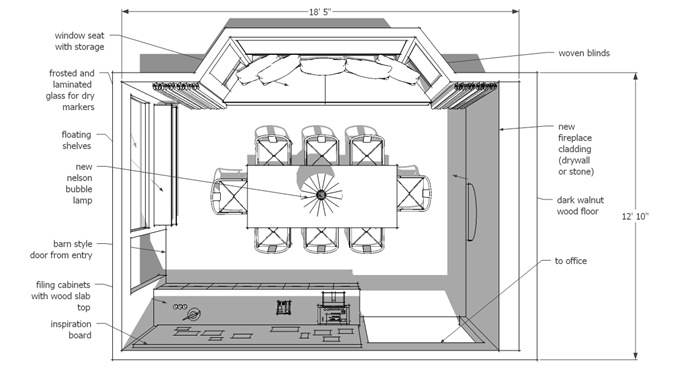
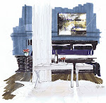
What do I love? I love the contrast of walnut and modern white. I love the juxtaposition of texture and smooth. I love the bubble lamps by Nelson. I love red and brown…the Wishbone chair by Wegner, and more filing and surface space than I need. This is how all of those things would ideally come together in a new meeting/work space. Cover the cabinets with a linen cloth, and you have a great dining space for special occasions.
Design and Renderings by Michelle Morelan Design


6 comments:
Great idea Michelle.
Love the versatility of the space.
Michelle, this is brilliant! I really love the walnut and red as well.. And you know what else stands out - A FULL arch fireplace - It's always a big square - the arch is beautiful in this design..
Cool solution for the space!
I have to say that I am not big fan of window benches but I think in this case adds the punch of colour that the room was demanding.
LOVELY meeting room!
Thanks for stopping by... glad you like my new header!
Your sketch-up skills are terrific, Michelle!! I think I need to take some lessons from you ;-)
I've been crazy busy these last few weeks and so haven't responded to your suggestion that we get together soon for lunch... great idea! Only problem for me... it would have to be on a weekend day. Could that work for you? Let me know!! :-)
Victoria
I'm definitely going to have to spend more time with SketchUp if this is what you can get!
I love the texture of the stone wall and the punch of red is perfect!
Post a Comment