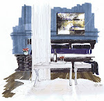
Moorage #304
storage and multi use spaces in 900 sq ft
storage and multi use spaces in 900 sq ft


renderings and interior design by Michelle Morelan, Interior Designer, BID


Where dining room seating is storage, kitchen cabinets stretch to the ceiling, and the DR table doubles as desk space. The stools are backless, and can be tucked away to use the bar as a buffet, allowing the space work for one person or 20.
I know the "Woods" wallpaper from Cole and Sons is overused...but for the context of the space, it really works. Not to overwhelm the space, I have used the grey tree version, and balanced it's busy-ness with white upholstered furniture, and a strong blue on the walls in the main spaces, as well as the laminated glass backsplash.
I am really into white floors recently, and have to do more research about them, but look at the way you can contrast your millwork off of the flooring; or match the two for a seamless transition. Vincente Wolf has influenced me here. I love the way he uses the design principles of form and colour...monochromatic for the most part, but with hints from him on his blog to see more colour soon.
The Moorage is really coming along; millwork is installed in most units, the penthouse clients have all the tiling done, and the show suite is still welcoming visitors on Sunday afternoons. Like all real estate, the prices have been reduced, making them quite a bargain. All have decks, some have front deck spaces, and Phase 2 will offer seasonal accommodation, in a split level layout.
 architectural rendering by CI Neilsen Architects, Nanaimo
 Phase 2- The Moorage, Ucluelet B.C.
 Photo by Graeme Owsianski-graemephoto.com
If you would like to check out the Moorage in Ucluelet, click here. You can look at the show suite photos on my website.


7 comments:
I absolutely love your cleaner format! New photo, new header, and your latest post! You are an extremely talented designer and I am so happy to have met you!! (I see you were up in the wee hours making it happen!)
LOL...I have some sleeping issues lately...maybe it's my age...
You are so sweet...thank you for the compliments.
I need to know... how do you insert such large pictures in your blog? I chose large, but they don't seem that big.
Smiles...
Michelle,
I love your renderings, I also loved your attire at Patricia's Open House - really cool geometric pattern :)
Very nice new look Michelle and a nice new picture
I like what you are doig in the latest post.
I like the clean lines and the color scheme.
Thanks Ivan and Tareq,
I am so happy I found all you bloggers this year!
Have a great 2009!
Your renderings are lovely. I really like that blue.
dwellings and decor
Love it! This is my first time reading Schematic Life but I'll definitely be back again!
Happy blogging :)
Post a Comment