
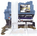
 Formal symmetry and informal textural siding and furniture juxtapose each other, allowing you to feel comfortable yet pampered by the spa white upholstery
There is a lack of colour palette, but one rich in texture and married to nature in an uncomplicated way
 The ceiling beams and antiqued walls refrence the age of the house and to Amsterdam's past. Whites and ivories work together with the grays and browns being a buffer
Washed concrete and wide plank floors remind you of the age and location of the house. The reflective pieces provide a modern touch and another layer without adding colour. I love this home because of the way the homeowners used texture and colour, mixed in history and what works for a modern family.


Greys, browns, black and whites are mixed in a perfect ratio in the kitchen. Natural linen drapes in grey tones let some light in, but provide privacy and light control

 The master bedroom includes a woven wing chair bed design; I always start with good quality white hotel linens on the bed, and add colour or texture. This throw adds instant texture and implied comfort. The room also included that punch of reflective in the lamps, table and tray service, and the drapes draw thier colour and texture from the throw and the chair...a nice mix that works well

 I have been reading and while in Paris noticing this "Parisian empty" look. I think this bathroom speaks to that. There is an "under construction, pictures not hung yet" look. The old chandelier may have been purchased at the Paris Fleas, and the existing beadboard is simply painted. The floor is interesting and includes the colour palette of the interior; from greys to browns to ivories. Collected items have implied importance, and there is a restraint practiced. The home has not lost the feeling of being developed over its lifetime

 The master bedroom includes a woven wing chair bed design; I always start with good quality white hotel linens on the bed, and add colour or texture. This throw adds instant texture and implied comfort. The room also included that punch of reflective in the lamps, table and tray service, and the drapes draw thier colour and texture from the throw and the chair...a nice mix that works well
 I have been reading and while in Paris noticing this "Parisian empty" look. I think this bathroom speaks to that. There is an "under construction, pictures not hung yet" look. The old chandelier may have been purchased at the Paris Fleas, and the existing beadboard is simply painted. The floor is interesting and includes the colour palette of the interior; from greys to browns to ivories. Collected items have implied importance, and there is a restraint practiced. The home has not lost the feeling of being developed over its lifetime
4 comments:
I saw this article and liked this house a lot. I liked the neutral colors and the faded palette.
Oh it is such a gorgeous house! I saw the cover & got so excited...we are a bit slow in receiving the magazines here, but at least we eventually get them. Have a great week! Amanda x
Thanks for the visit Amanda...guess we have similar taste!
Glad that you visited my blog because I'm happy to have found yours now! Love the tub in that last photo.
Post a Comment