Tuesday, 31 March 2009

Architectural Digest- 25 Years of Inspiration

ad cover exotic homes

I have had a love affair with Architectural Digest since the early eighties. That was when I discovered it on my news stand while looking for Seventeen. It was the Exotic Homes Around the World issue, and I remember being hooked instantly. A home in Mexico was featured, where there were no exterior walls, making the outdoor and indoor of the home seamless. I had never seen anything like it.

This was a step up from the Sears catalogue that served as my first design magazine.  I grew up in a very small town (less than 1000 at the time), and the Sears Catalogue was our only way to buy, aside from a 2 hour trip to a, not much better town, Growing up, I felt culturally isolated, but AD represented the best of the best …and set my life path in motion.

my AD library

My AD library…the last 10 years

Over the years I didn’t miss the AD100 issues, following the careers of Thomas Pheasant, Carleton Varney, Scott Snyder, Michael Smith, David Rockwell and Mariette Himes Gomez to name a few.  I have been introduced to the Legends of Design; Elsie de Wolfe, Albert Haley, John Michel Frank, William Haines, Sister Parish, David Hicks,  Andree Putman and Mark Hampton, again, just a sampling. New favourite designers emerged, like Anouska Hempel and relationships were revealed, when I realized Alexa Hampton was following in her father’s footsteps. I visited places mentioned, like the Dylan in Amsterdam, Taliesen West and the Delano in Miami; all amazing!

thomas pheasant

In Sept. 2003, Thomas Pheasant let us peek into his Georgetown Gatehouse-  Photography by Durston Saylor

sills huniford AD

Remember this bathroom by Sills Huniford in April of 2002? A 290 gallon Japanese tub over looking Manhattan…they got my attention, although I have heard they have split.

ad legends cover

ad cover ad 100

Later, Paige Rense’s introduction, the Designer’s Own Homes issue and Interior Design Legends became reading I looked forward to. Celebrities homes like John Travolta, Diane Keaton and Demi Moore have been memorable among others. Kelsey Grammer’s home in  Hawaii was so inspiring!

kelsey gramer ad

Kelsey Grammer in Maui, Interior Design by Kathy Merrill, ASID, Photography by Mary E. Nichols

The photos in AD are top notch…I have been introduced to the photography of Tim Street-Porter and Scott Frances. From southern mansions, Mexican open air homes to west coast modern tree houses, the magazine both looks forward and backwards to give us the full story. Even the ads are worth browsing.

mindel and photo by scott frances AD

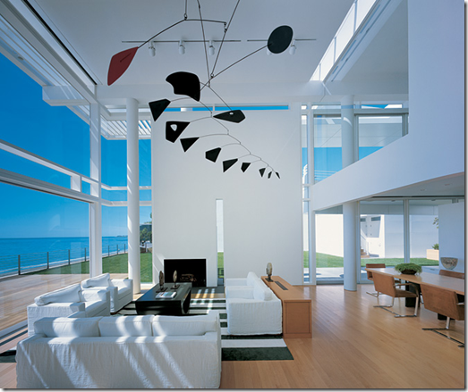
Interior Design by Shelton, Mindel and Associates, Photography by Scott Frances, AD April, 2002

photo by scott frances arch digest calder rose Tarlow

Interior by Rose Tarlow, photos by Scott Frances, Architectural Digest

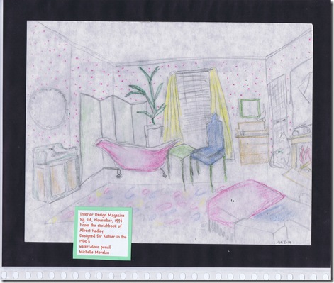
Albert Haley’s sketches featured in 1994,  inspired me to do these sketches for my portfolio to be accepted to Kwantlen. The magazine featured Mark Hampton’s book –Decorating, and it was my reference for this  fearless sketch; one that I look at now, and makes me realize how far I have come…eek!

portfolio sketches by me of mark hampton albert haley sketches by me for kwalntlen mmorelan a hadley sketches AD my portfolio for kwantlen 1 albert haley

Vancouver’s Patricia Gray has graced your pages…a well deserved honour for great solutions and a beautifully designed Gastown loft. I now know the Regina chair by Poltrona Frau, and how to deal with just 3” of ceiling plenum space. Being one of the only Canadian designers to grace the pages, I think she has yet to pull her trump card, since all of her projects are AD worthy.

patricia ADpatricia 2

Interior Design- Patricia Gray, Photography- Roger Brooks; Architectural Digest, Dec. 2006

AD has gone in and out of vogue, but I have religiously collected the issues since my early 20’s. New magazines have come and gone, but AD has stood the test of time, I believe, because of the roots of design they embrace and the quality of the photos and the homes featured. I have also considered that it may appeal to a more mature demographic, since they don’t focus on the DIY, but Interior Design as a profession.

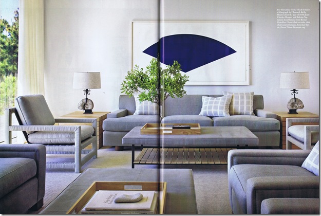
This months issue got me thinking of AD for several reasons- first because Albarosa’s McGuire chairs are on page 145, and we were admiring them at her dinner party. Also, because of the gorgeous beach house by Thad Hayes and Stelle Architects on page 82. The dining room of a palatial Mansion in New Orleans (on page 108) by Alexa Hampton has been marked for a rendering, because of the historical feel and greens.

thad hayes

Interior Design – Thad Hayes, Photography – Scott Frances; Architectural Digest, April, 2009

So, thanks for the inspiration AD! I hope you continue to offer education and insight, to us all, for a long time to come!

Saturday, 28 March 2009

A Chaise and Pink Peonies

chaise and peonies

A commission being sent out on Monday…hope you like it!

Tuesday, 24 March 2009

Work Break

83266077

Must be spring, because everyone wants to work on their home. It’s nice to have the business, so blogging will have to wait for this week. I miss you already!

Monday, 23 March 2009

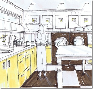
Chocolate Laundry

image

 Rendering and Design  by Michelle Morelan, Interior Designer, BID

Such a great marketing ploy that Miele has come up with.

Patricia Gray wrote about receiving a beautiful box of chocolates at her studio, from Miele, promoting their new Limited Edition Chocolate Laundry. Is the colour brown coming back into vogue? In a less seventies kind of way? Check out this posting on Style at Home as well.

If you look to nature, and the tones that we feel comfortable with- the greens, blues, browns and greys of a forest  why not make  German engineered beauties like this in dark brown?

image

Miele claims that their machines reduce fabric strain, making clothes last longer, but also gets them cleaner. Well, hopefully they get out chocolate! 

miele laundry yellow and brown cropped_march 24 09 Rendering and Design  by Michelle Morelan, Interior Designer, BID

I was in for some SketchUp training, so here is my idea of the perfect chocolate laundry with a deep SS sink and countertop, great modern faucets, a graphic linoleum floor, high gloss yellow millwork, a large folding table, a TV and plenty of storage for your steamer, vacuum, ironing board and sewing supplies- thanks Miele!

Friday, 20 March 2009

Original Oils

CIMG7559 CIMG7553CIMG7563

  How fun to get out the paints again…very relaxing!

This is one of two canvases I am working on at the moment- it’s 30”x48’. What way would you hang it?

Congrats!


DSC07859

Jessica and I on our graduation day- 2006

My friend Jessica just learned she has been accepted into the Masters of Architecture Program at UBC!!!!!!!!! It was a long process, but she took it head on, with no fear, in her usual style.

image

Jessica is a World Traveller, Photographer, Interior Designer and soon to be Architect…what a great mix. She is one of those friends you can call up and say meet me at the airport- we’re going to Taliesin West for the weekend, and she’s there- yup, we’ve done that! Some of you have asked if I travel a lot with my husband, and I have, but the best part about travel benefits is sharing them with your friends :)

   DSC00917 DSC00944

At Taliesin West, 2002

DSC01008

Scottsdale, 2002 (I believe this is the Inn at Camelback Mt. (Four Seasons) -right before we went 4 wheelin’ in the rental car to see some gorgeous mansions like these:

DSC00998

DSC01002

She has spent a couple of months in Egypt, and driven through southern Italy (with a handsome man in a black convertible BMW no less), among many things. She is an example of how we should push ourselves to experience life, and she “gets it” in her mid twenties…wish I would have!

I knew she would get in! You deserve it Jess- you are a talented, strong woman, mature beyond your years. I am happy to call you my friend…now how long before you can stamp my drawings?  :)

Congrats!

Monday, 16 March 2009

MMR Interior

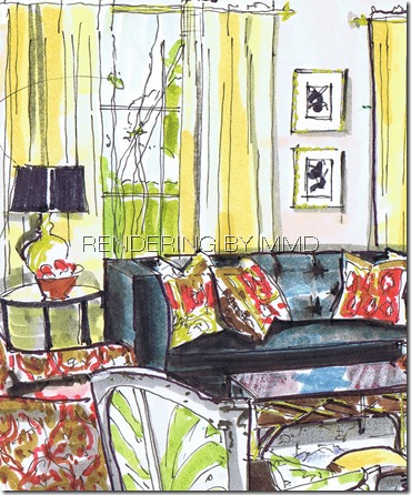
Have your heard of Melissa Rufty, and MMR Interiors? I had their firm saved in my favourites for quite some time, but this morning had the need to render one of her interiors on the spot. I used kind of a heavy hand on this one, but it’s fun to experiment with colour, line and shadow.

image

Here is one of her stunning projects…don’t you think her use of colour is amazing?

Melissa Rufty

 Melissa Rufty left side cropped close

Melissa Rufty left side cropped

I would love to go back now that I see the rendering, and give one side of the greyed legs on the green chair a dark line to separate the legs from the chair shadow.

I would also, go back with the most vibrant yellow I have, and darken the curtains above the arch of light, and all of the other panels, leaving some white and grey. I’d like to straighten the legs of the round table, since it seems a bit askew. 

Solus- More than Fireplace Surrounds

image

Solus Decor in Vancouver makes amazing tiled and stone fireplace surrounds

image

And these amazing fire bowls that I got to see at the IDS show in Vancouver a few years ago.

image

They also do outdoor surrounds.

image

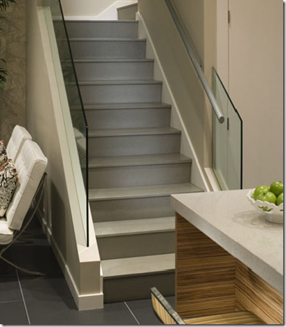
Concrete stair installations

image

Door jams…what a great idea!

image

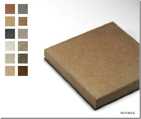
Solus makes these great square planters…offered half sphere, and in a trough style as well. They are available in these great colours

image

image

If that wasn’t all enough…now they have started making benches from concrete. I love the colours they offer, as they are earthy and organic.

image

The concrete tiles they produce are in sensible stock sizes, but can also be produced in custom dimensions, giving the designer lots of flexibility. I have specified both custom and stock tiles from Solus, and their customer service, and on site installers really want to get it right for you and your client. I highly recommend them!

Sunday, 15 March 2009

Message in a Bottle Set

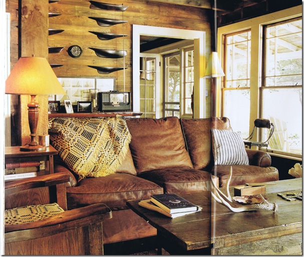
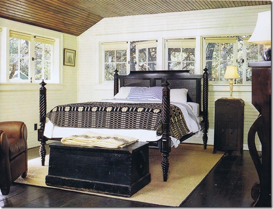
Back in the late nineties, Kevin Costner stared in a chic flick called “Message in a Bottle”…well I was smitten with the movie; mostly because of the set! It was so memorable and was so appealing to me, even know it’s very masculine. I imagine painting the afternoon away listening to Beethoven, Nina Simone or CBC Radio, enjoying the long summer evenings with a cold glass of lemonade.

The production designer was Jeffrey Beecroft, and he was trying to tell the story with objects instead of words.  He said “I wanted the character’s house to feel isolated and somehow romantically haunted, but comfortably masculine, too”- and that he wanted the interior to evoke the inside of a ship. 

I dream of such a getaway…one where you take off the white sheets from the furniture and open the house up for the warm season, and where everything creaks. Where the dust is caught in old screen doors, and the fireplace warms you, as you sip strong coffee and reminisce with friends (if you chose to share this space with anyone else, that is).

*Check out the apothecary chest full of seashells…yum.

costner2

costner1

kitchen miab set miab set 5kitchen miab set2 miab set 3

miab set 4Photos from Coastal Living March/April 1999; photography by Bruce Buck.